Clair.Tech — Reimagining Healthcare UX for Doctors and Patients
Bridging Communication Gaps in Digital Health
Designing intuitive interfaces that improve healthcare outcomes through better doctor-patient communication.
Role: Product Designer · UX Strategy · Brand Design Scope: Brand strategy, public website redesign, internal platform UI, design system, medical program integration (Life 360 / Anau)
When Clair.Tech approached me, their platform and public website needed more than just a visual update. They needed a strategic rethinking of how the brand communicates its purpose and how the platform could scale to support more complex programs in women's health.
My Role
I partnered directly with Clair.Tech's leadership and an OB-GYN doctor to shape the next evolution of the product. My responsibilities spanned from design direction to product strategy, making decisions that prepared both the external presence and the internal platform for long-term growth.
Public Website
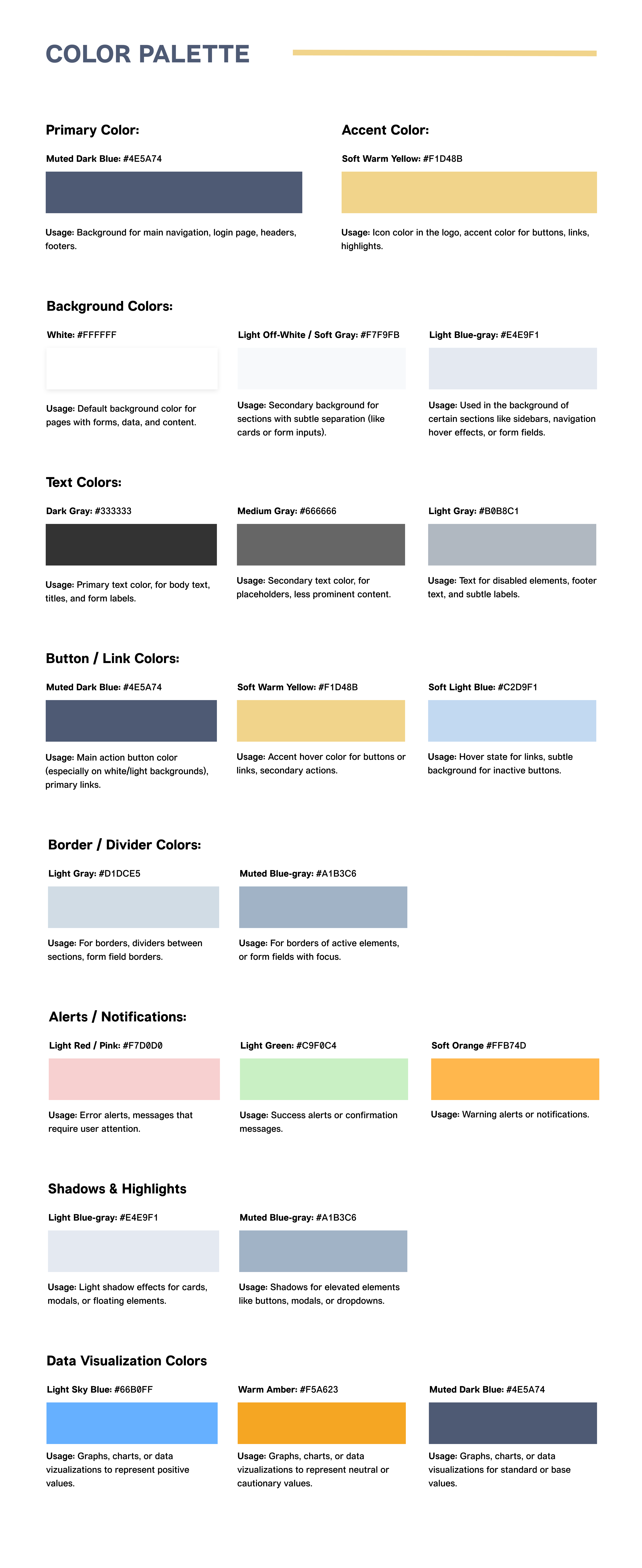
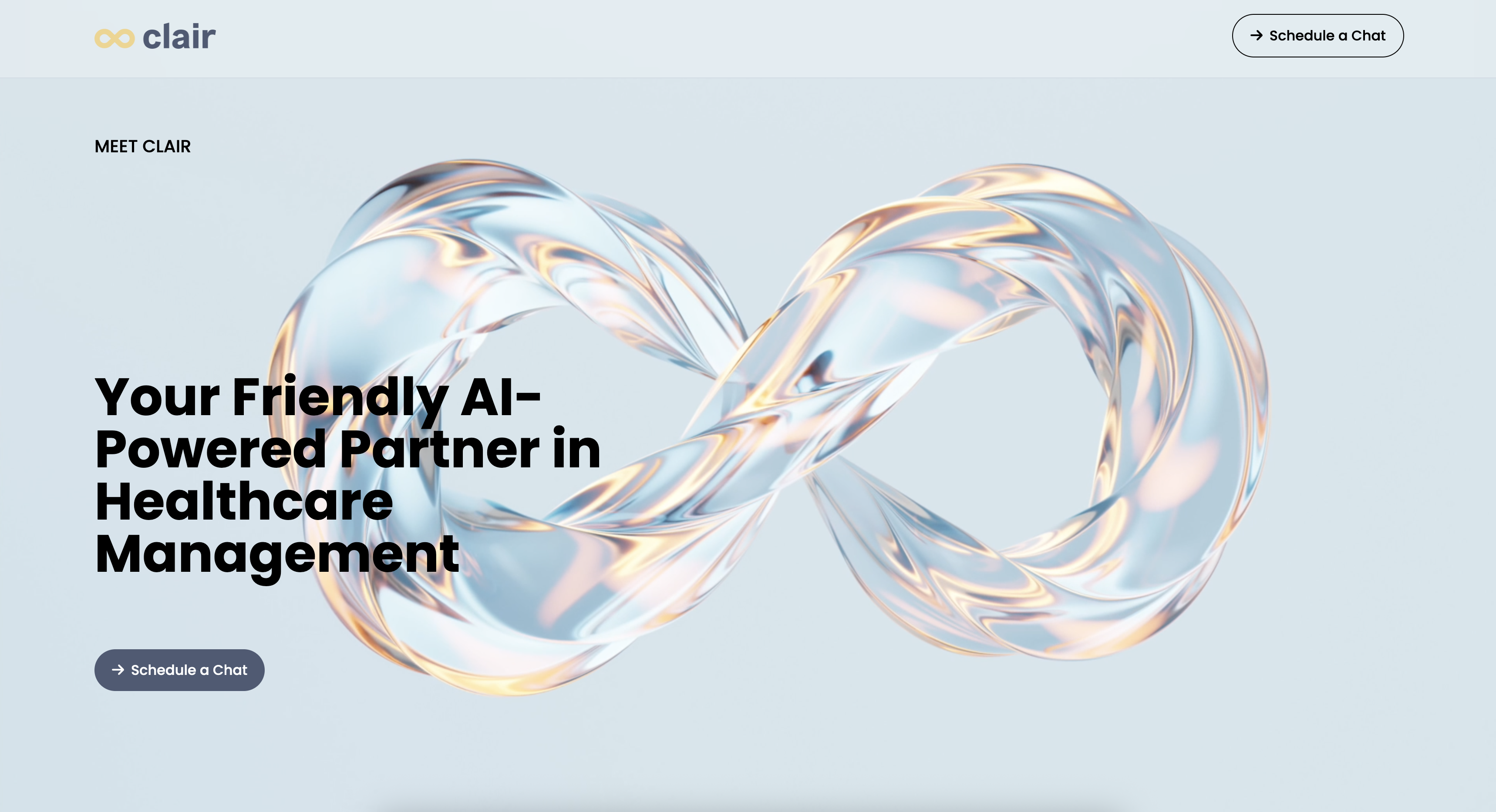
For the website, I redesigned the experience from the ground up, creating a clean, modern, and elegant interface. I defined a confident brand voice that communicates Clair.Tech's mission with warmth and authority, while building intuitive navigation that simplifies access to resources for patients, doctors, and partners. I also ensured the website was scalable and adaptable, capable of evolving as Clair.Tech expands its offerings.
The result was a public presence that not only looked polished, but also clearly communicated Clair.Tech's vision to a wider audience of patients, doctors, and potential partners.
Internal Platform
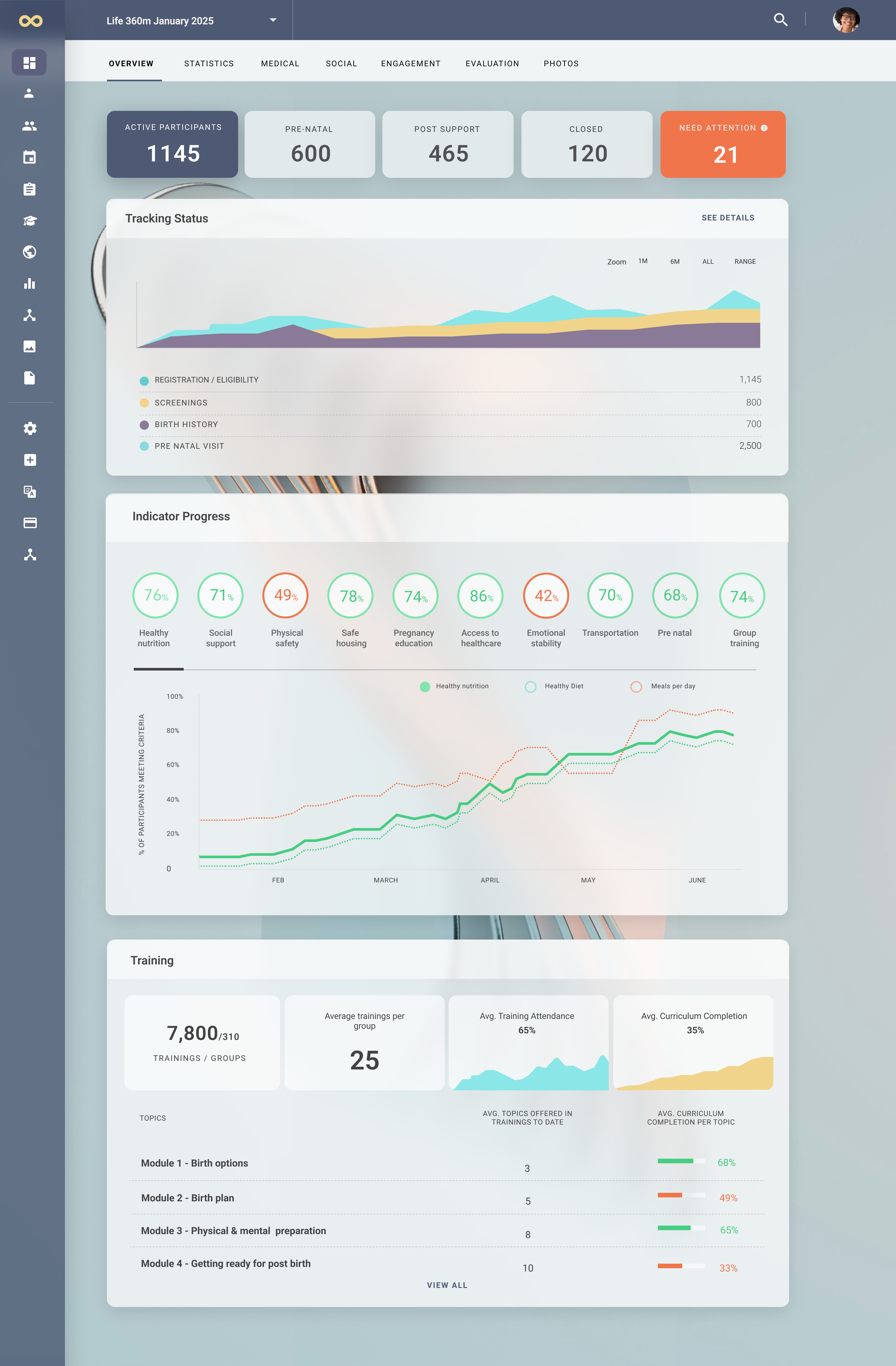
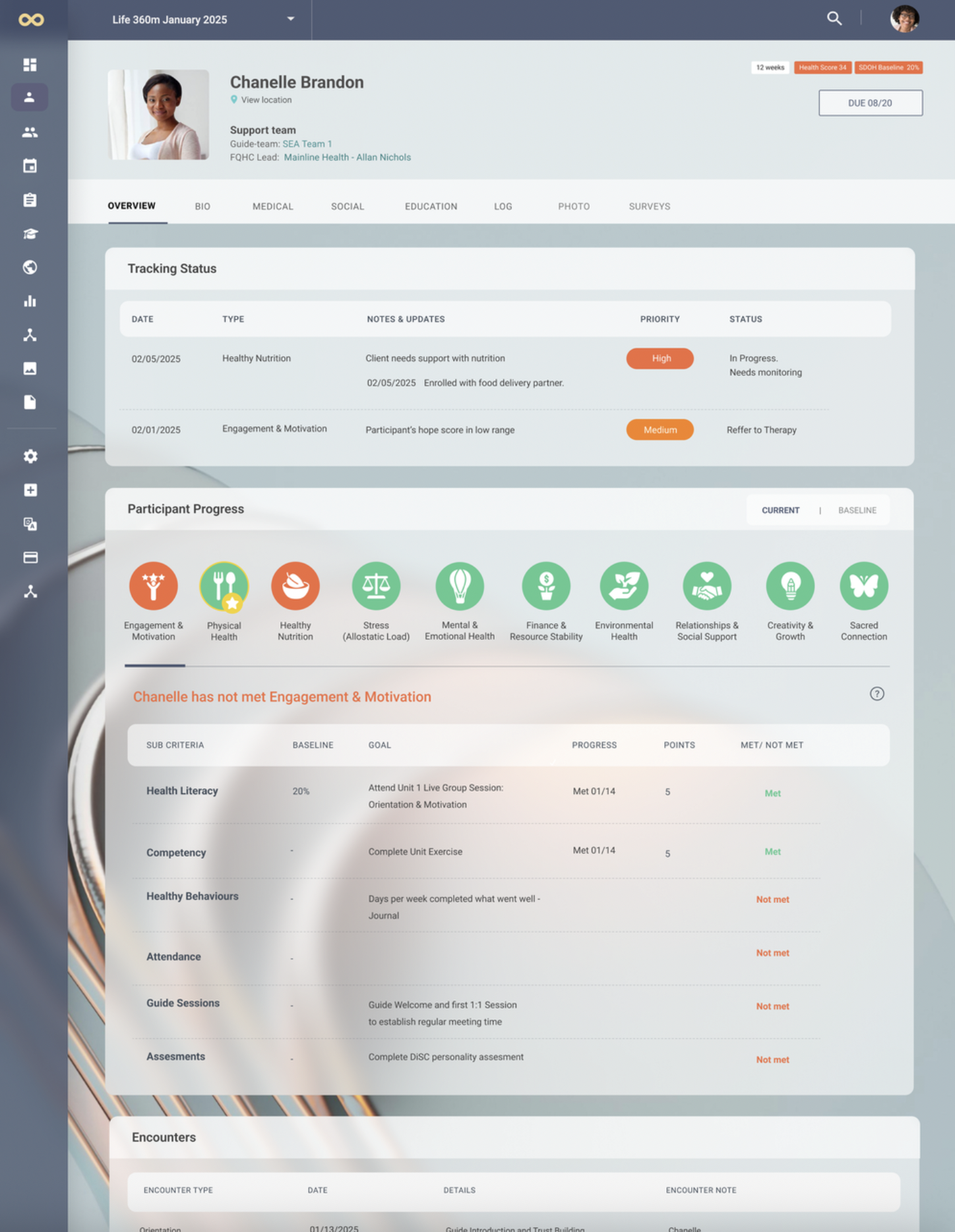
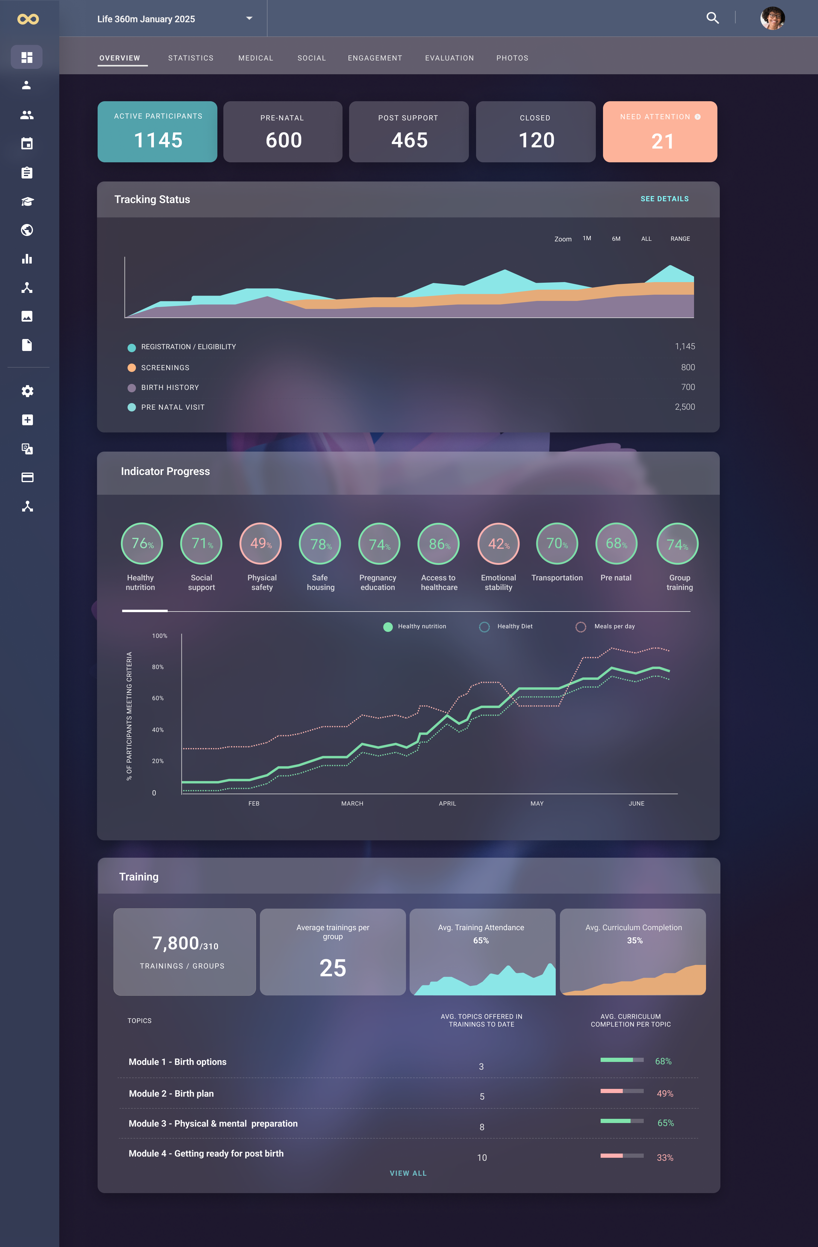
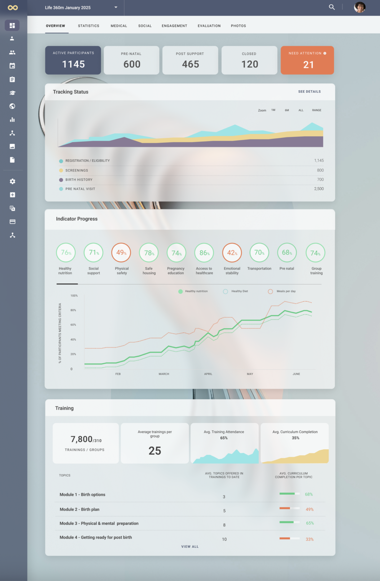
On the product side, I led a comprehensive visual facelift that not only refreshed but also humanized the entire user experience. My goal was to move beyond a purely functional interface and create an environment that felt approachable, modern, and forward-thinking.
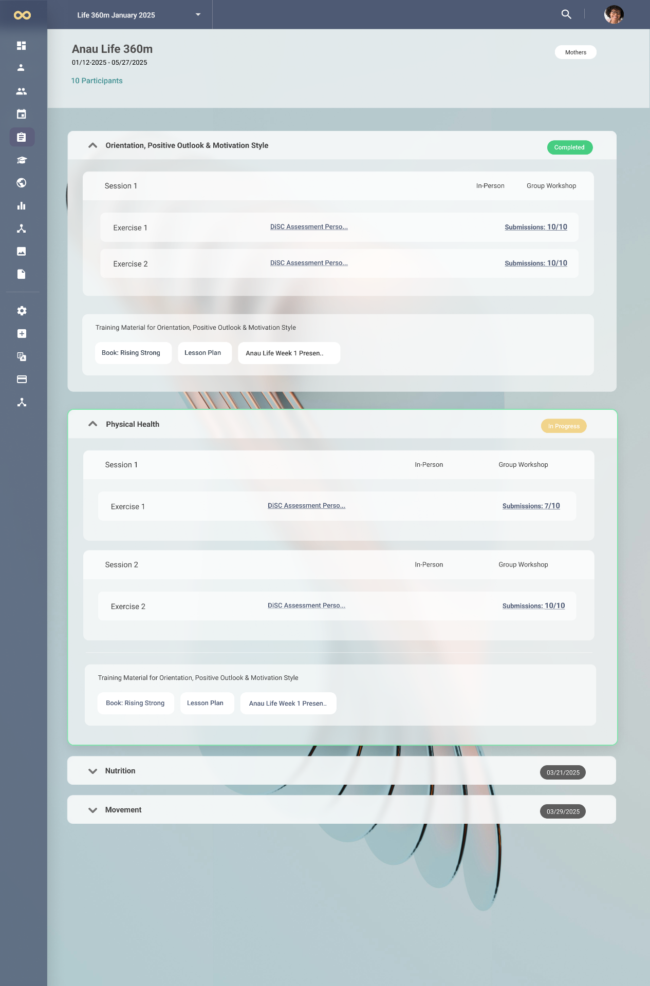
To achieve this, I introduced glassmorphism — using subtle frosted surfaces, layered transparency, and carefully considered dimensionality — to bring a sense of lightness and clarity to the product, while also signaling innovation and progress in the health-tech space.
This aesthetic direction was not applied for visual appeal alone. I carefully balanced these innovations with existing system constraints to ensure the updated design could be seamlessly implemented within the platform's technical foundations. At the same time, I restructured the design system with scalability in mind, establishing flexible patterns and reusable components so that more complex programs and features could be integrated in the future without requiring a fundamental redesign of the core elements.
The result was a product experience that not only looked and felt elevated, but also positioned the platform to grow sustainably alongside Clair.Tech's expanding mission.
Incorporating the Life 360 Program
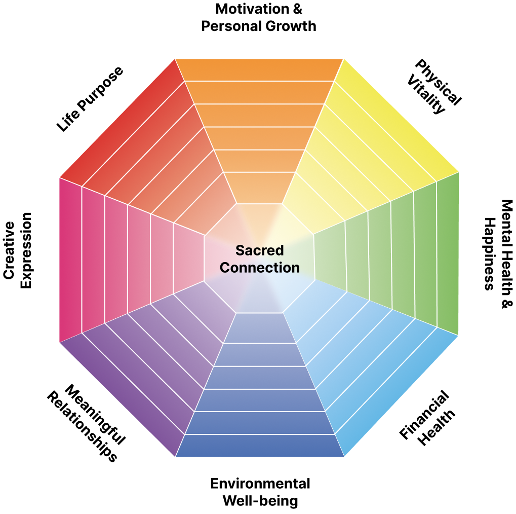
A key moment in shaping the platform came from my collaboration with an OB-GYN doctor who had developed Life 360, a program designed to guide pregnant women through healthier pregnancies with a holistic focus on nutrition, wellness, and medical guidance.
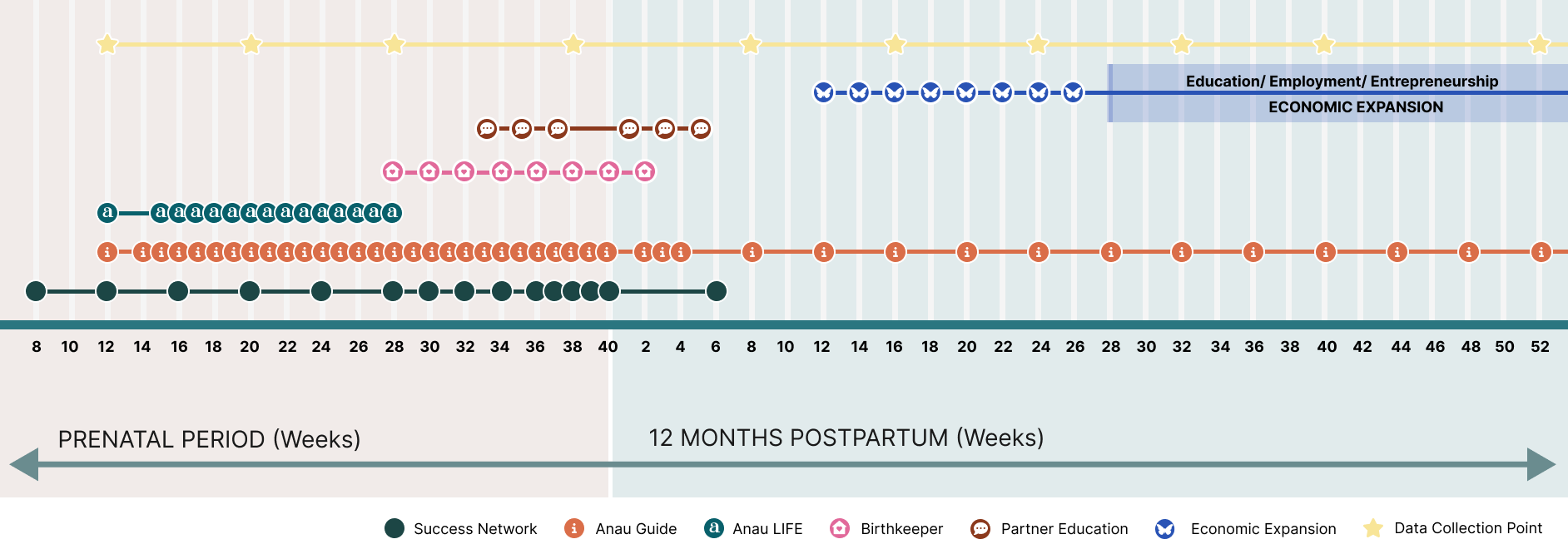
To bring this initiative into Clair.Tech, I began by researching patient and doctor needs in detail, conducting structured interviews and aligning closely with medical expertise to ensure both accuracy and empathy in the design. From there, I mapped patient journeys to create a step-by-step flow that could support women from early pregnancy through postpartum care, making sure the experience felt both guided and adaptable to individual needs.
I then designed flexible program modules that could be easily customized and scaled, positioning Life 360 not just as a single feature, but as the first in a series of programs Clair.Tech could offer. To support this, I established a robust framework that allowed medical programs to integrate seamlessly into the platform without disrupting the overall user experience.
This collaboration became a cornerstone in demonstrating how Clair.Tech could evolve into a scalable, patient-centered ecosystem while maintaining medical integrity and design clarity.
Guiding Philosophy
At every stage, I asked: How can we make complex technology feel lighter, clearer, and more human? This principle guided both my design and strategic decisions, ensuring that the platform could carry the emotional weight of women's health while remaining approachable and future-focused.
Landing Page for the Anau Program
As part of the Clair.Tech collaboration, I also designed the landing page for Anau, the first program bringing the Life 360 vision to the public. The goal was to create a digital presence that reflected the program's essence: every birth as sacred, every life as whole.
I translated this philosophy into a design that combined warmth, reverence, and clarity — using bold statements, earthy imagery, and a modern yet human-centered layout. The page weaves together storytelling and structure, introducing Anau's vision, approach, and initiatives while guiding visitors with a sense of trust and inspiration.
More than just an introduction, the landing page became a living expression of Anau's mission, setting a visual and narrative foundation for future holistic health programs under the Clair.Tech umbrella.

Outcome
The reimagined website and platform gave Clair.Tech a confident public presence that resonates with both patients and professionals, while also establishing an internal foundation ready for growth. The platform was designed to host holistic health programs like Life 360 and beyond, supported by a design system rooted in clarity and scalability to ensure that every update reinforces both trust and usability.
This project was never just about refreshing visuals — it was about shaping a product vision. By bridging the gap between brand storytelling, medical expertise, and technical scalability, I positioned Clair.Tech to grow confidently into the future of women's health, with a platform that is both human-centered and adaptable to evolving needs.