Case study — Outsite (Senior Product Designer & Frontend Developer)
Website: https://outsite.co/
Shaping a seamless remote-work & travel experience — designing for the digital-nomad era.
Outsite is a global network of coliving spaces for remote workers, freelancers, and creatives who want flexibility, connection, and a sense of home while working from anywhere — comfortable stays plus coworking, curated communities, and local experiences. Sabrina owned design and frontend across the booking and marketing surfaces, working closely with the dev team in React/Next.js and Figma. Highlights:
Homepage redesign — immersing visitors in the experience
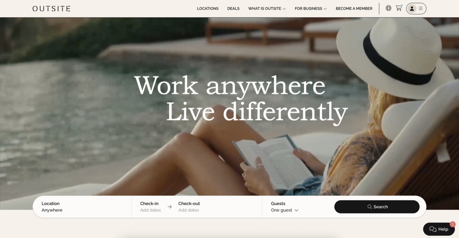
Research and analytics showed visitors bounced off the homepage because it wasn't clear what Outsite is, and the key element — the location search bar — lived on a Locations page many never reached. The fix: immerse visitors in the Outsite experience the moment they land, via an appealing video of the locations, vibe, lifestyle, and community, paired with a floating Locations search bar that invites exploration.
- 31% drop in homepage bounce rate after launch.
Deals Hub — surfacing a hidden conversion driver
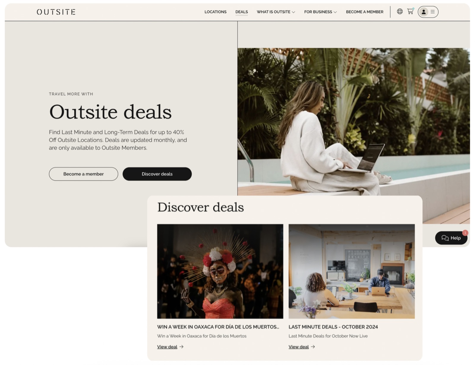
The deals hub lived inside a Notion space — hard to find and explore. After studying competitors and inspiration, Sabrina found that prominently featuring deals is a major conversion point, and designed a user-friendly Deals Hub in the main navigation where users can browse offers and understand Outsite's exclusive deals.
- 17% increase in bookings of properties with deals after launch.
Promo rates inside the booking flow
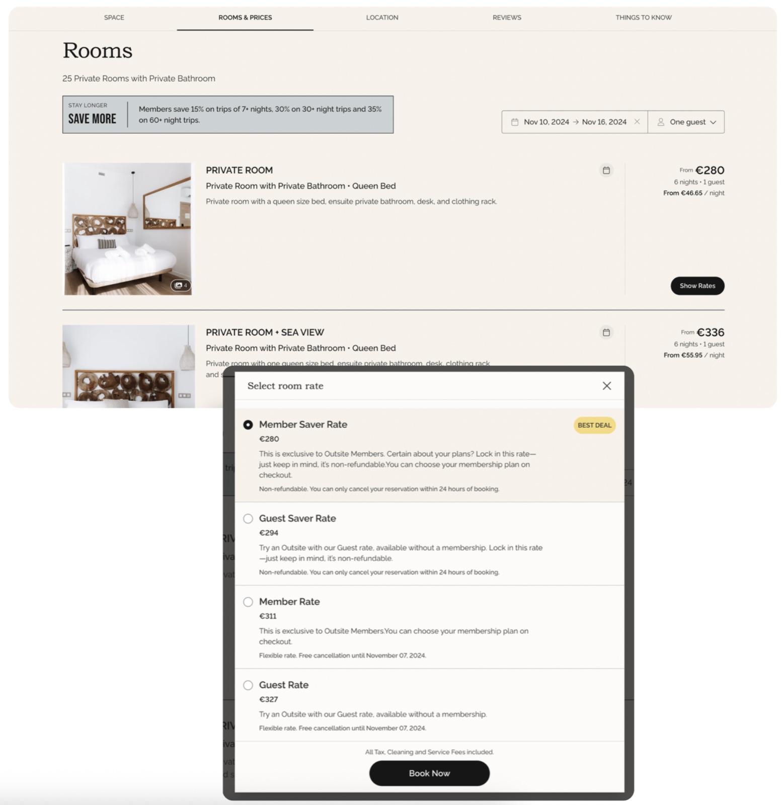
Before, only promo codes existed — and promo rates often expired while a customer was still in the cart, causing errors and checkout confusion. Research pointed to baking the discounted price into the room rate across the whole booking flow. The result: new room rates paired with a flexible cancellation policy, removing the expiry friction.
Team Retreats — rebalancing the portfolio
Some properties consistently out-booked others, leaving an imbalance. To lift the less-booked locations, Sabrina designed and shipped a dedicated Team Retreats page that strategically highlights those underused properties and encourages group bookings.
- 22% increase in group/team bookings after launch.
Membership page redesign
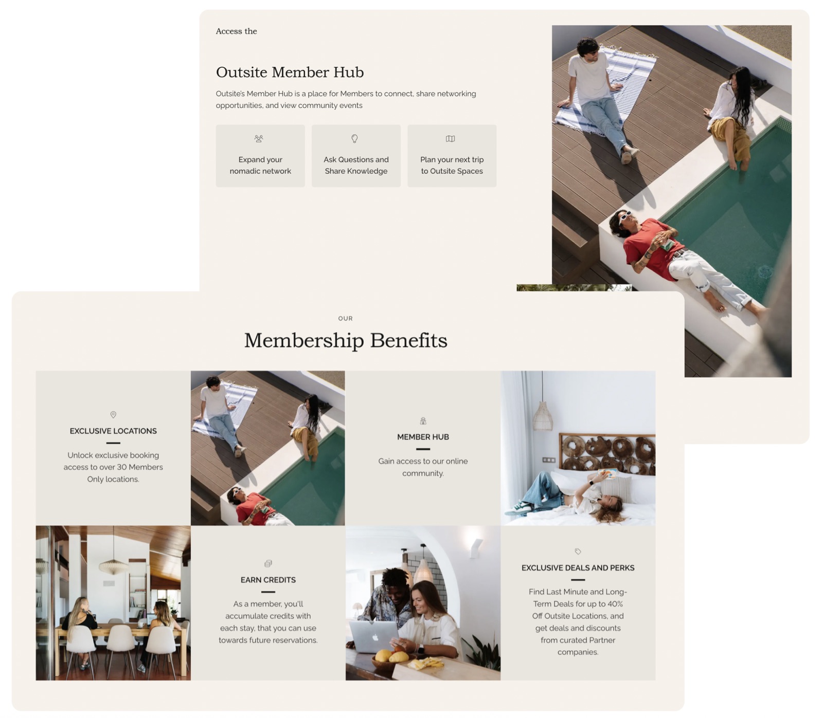
She reworked the membership page to highlight member benefits and perks, with clear, visually appealing sections, and let users view and purchase plans directly from the page — cutting the clicks to "Book now."
- 12% increase in membership applications after launch.
Dynamic "What's New" homepage section
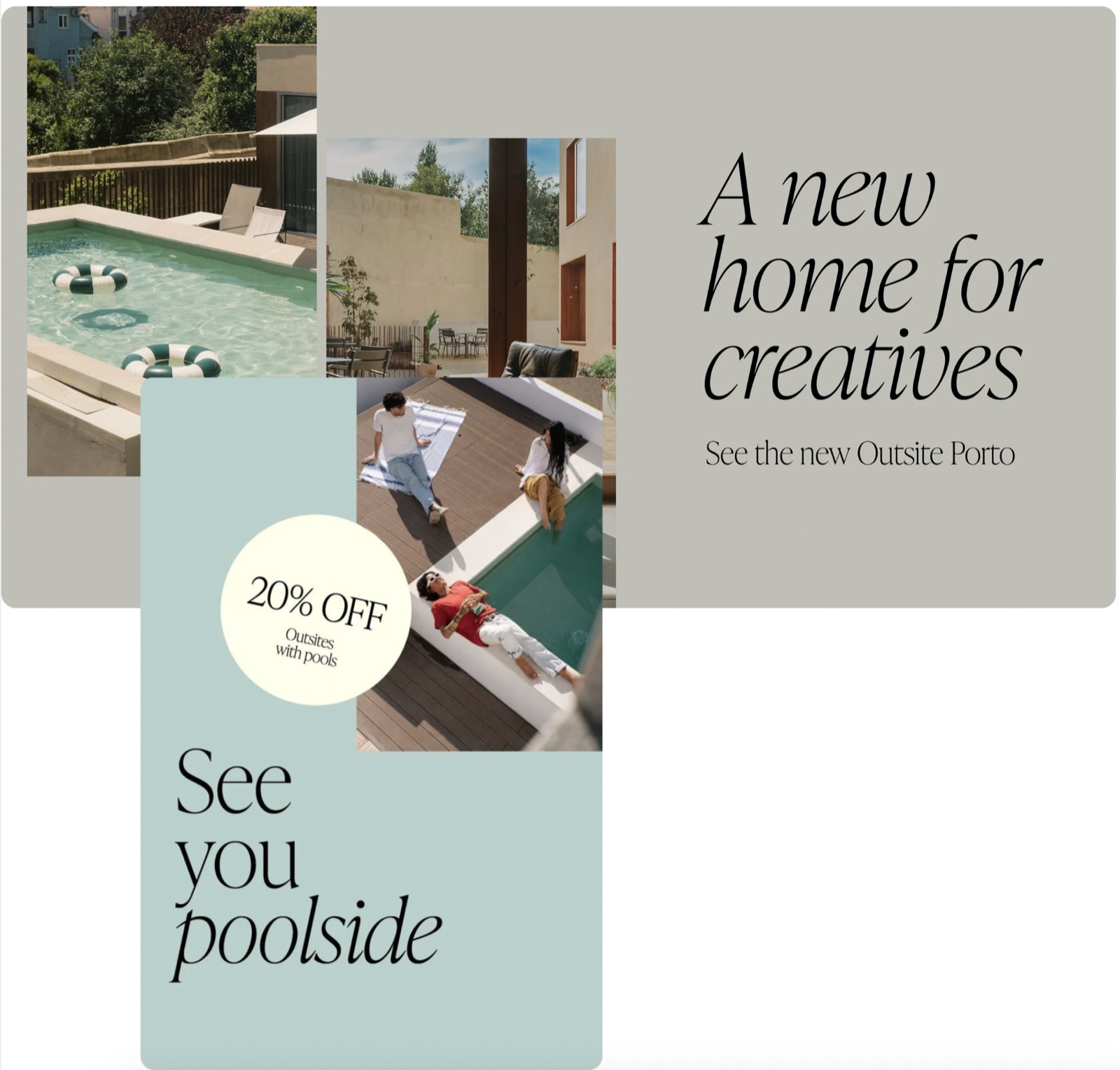
A homepage section that refreshes weekly to rotate the best deals and new properties, with strong visuals and clear calls to action to keep content fresh and drive exploration.
- 27% increase in navigation to highlighted locations after launch.
Why it matters
Six shipped initiatives, each tied to a measured lift — bounce, deals, group bookings, membership, and engagement. It's a clear example of Sabrina pairing UX research with hands-on design and frontend to move real product metrics.